We’ve mentioned recently how you can measure the success of the Absolute line, and the entire All In era, at DC Comics in a number of ways, but all those analytics point to positive returns for the publisher. Whether it be print runs, sales numbers or fan reaction and engagement, its clear that this fresh take on classic heroes is working.
There are still more titles to come in the new universe, a reality created in large part by the energies released during Darkseid’s seeming death in the DC All In Special released last October. Absolute Flash and Absolute Green Lantern are both on the way and offer new versions of these classic heroes that feel exciting, but still, somehow familiar.
This balance of bringing something new to these heroes while still having them be recognizable as the characters we have come to know and love has been the not-so-secret key to the success of DC’s latest publishing initiative. We have seen it work previously at other publishers, multiple times.
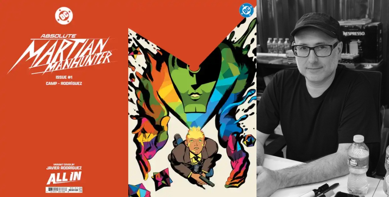
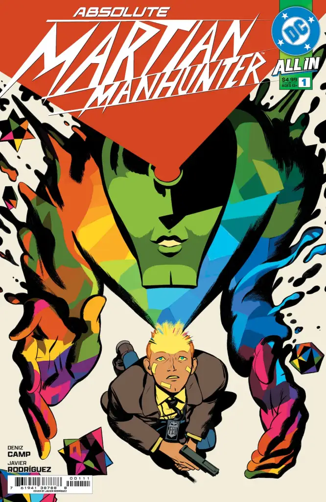
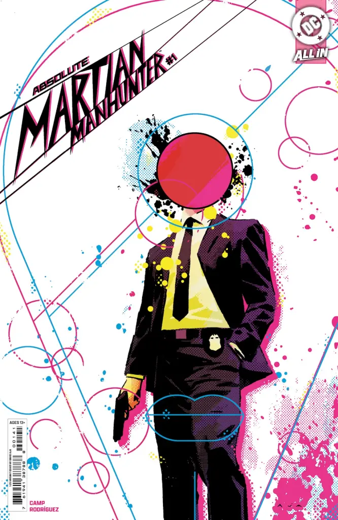
DC has additional titles to come in the Absolute line, although we only know the specifics for one more of them, Absolute Martian Manhunter from writer Deniz Camp and artist Javier Rodriguez. Perhaps what is most intriguing about this last title is that it is lacking that sense of familiarity. It certainly sets the book apart from the rest of the Absolute line and that is a very good thing indeed.
The original Martian Manhunter is perhaps the least well-known of the founding Justice League members. A survivor of a race of Martians that at various times throughout DC changing histories has been the last of his race while other timelines have him at odds with his native people. Despite these variations, the one constant has been his origin as an extraterrestrial from Mars. However, that is not the case with the Absolute Martian Manhunter and we are here for it.
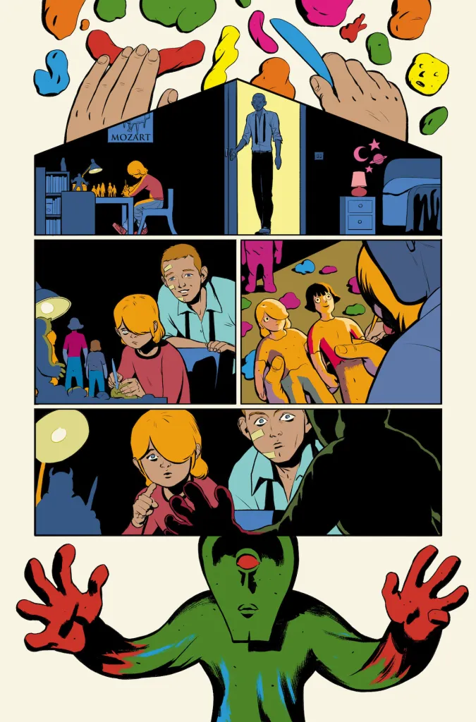
The Absolute version of Martian Manhunter is from Mars in name only. That is to say, when something is strange or weird and seems so alien that it must come from another planet, we might refer to that something as being from Mars or as a Martian. In this context, who is the eponymous alien of this new series? Well, you will have to read the first issue yourself to find out, but we will say this; Deniz Camp quickly establishes a tone for the book that does blend a sense of something familiar with something strangely new and exciting. This time, though, the familiar thing isn’t the character of Martian Manhunter himself, rather it is the aesthetic of the story itself. In no way, would this be possible without the incredible artistic contributions of artist Javier Rodriguez.
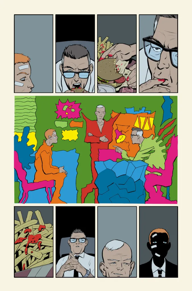
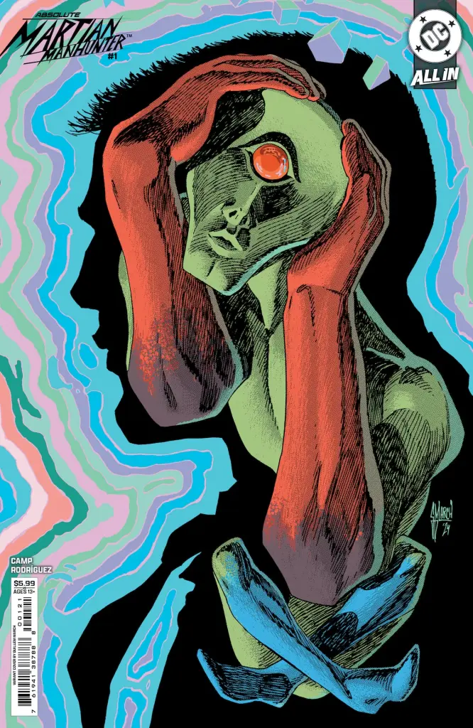
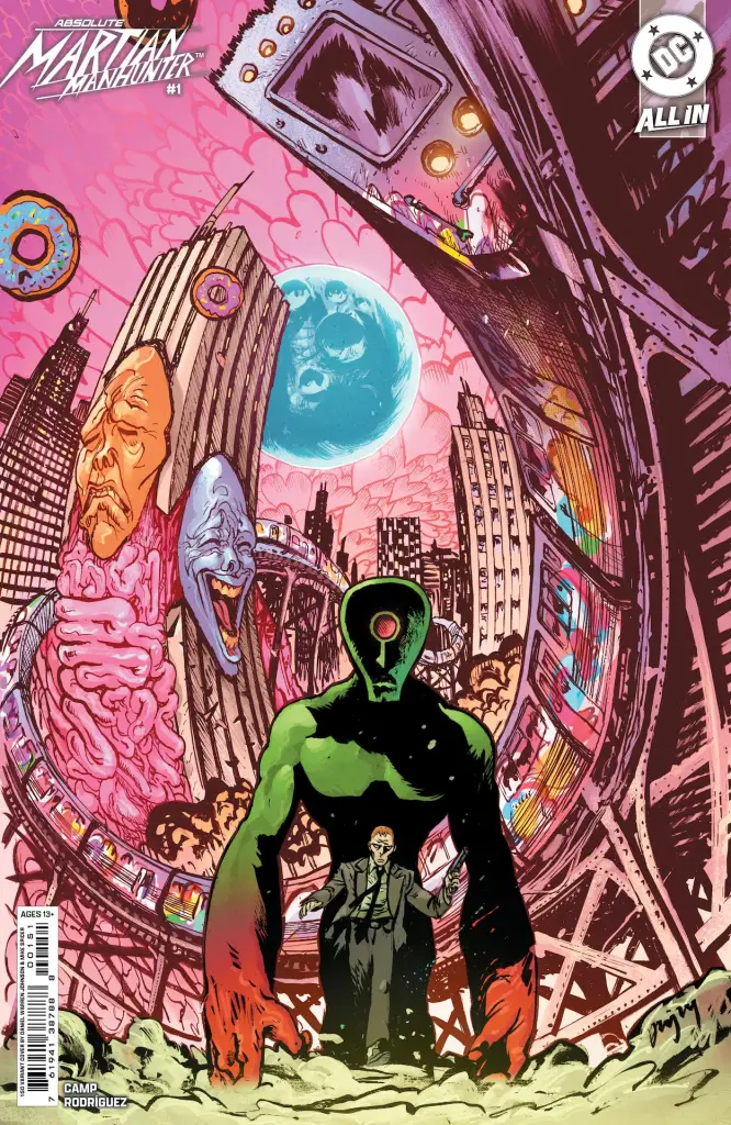
Using very clean lines, along with a mod art style, and perhaps just a hint of pop art feel, reminiscent of the 1960’s, Rodriguez delivers visuals that immediately set the tone for the story that unfolds in the debut issue. Also, the color work from Rodriguez is so integral to this story, we can’t even go into detail without spoiling some very important aspects of the story. We did get the chance to check in with Javier Rodriguez about his approach to the series and narrative he and Deniz Camp are crafting and you can see what he had to say below.
Absolute Martian Manhunter isn’t to be missed. It will be a welcome addition to the Absolute line when it arrives in comic shops March 26th.
(The below responses have been edited for clarity)
The Comic Source: Please tell us how you were approached to join the project
Javier Rodriguez: Katie Kubert asked me if I would like to participate in this project because Deniz Camp had actually asked for me. So, I read 20th Century Men and said yes. I knew it was going to be something big.
TCS: We’ve all heard the story by know of your character design for Martian Manhunter being in 3D, modeled from clay, can you tell us about why you chose to do that and how it helped develop the look of the character in a different way than just drawing?
JR: When I read Deniz’s pitch I saw that he wanted to move away from the classic superhero look. Knowing the freedom of the project I decided to make a powerful design but going out of my comfort zone. I remember I told Deniz and Katie that I was going to bring something that you could wear on a T-shirt in the summer. I wanted something powerful. So, I thought I would do it in 3D, without knowing how to use any software. I asked Miguel Bandera, a guy from my neighborhood who is very good with 3D, what he recommended for someone with no knowledge like me. And he told me: Play-Doh. I spent two days modeling with my daughters and that’s how Marty was born, which is how I call the doll in its original design.
TCS: When fans read the first issue they will see, just how important the visuals are to this story, especially when it comes to Martain Manhunter “using his powers”, can you talk about what’s unique about incorporating visuals into this version of the character?
JR: For me, comics is a visual medium above all else. If it doesn’t appeal to your eye and contribute to a goof story you want to read, I recommend that you go straight to literature. What makes the language of comics powerful is precisely that ability to use every graphic element available to tell a story in the most interesting and exciting way possible. So, I love using the medium’s own narrative resources to “show” how a character’s powers work, for example, rather than “describe”.
TCS: Was it you or Deniz who came up with the idea of visuals and especially color to evoke the alien feel of the book?
JR: Deniz was very clear that the moments of the alien’s manifestation had to be special and with a surprising visual aspect. He wanted to play with abstract shapes and figures. I think we talked about it a lot.
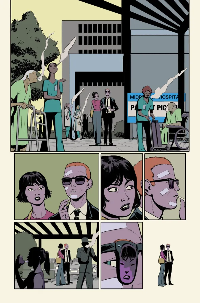
TCS: We get a bit of a mod art style, or 1960’s vibe in the overall setting, with John Jones being an FBI agent, things like The Man from U.N.C.L.E. or I, Spy feel like inspirations. Did you draw from any era specifically or some classic TV or Film to establish the feel of the world?
JR: All of this that you are telling me about strikes me as a beautiful period, a beautiful setting. It all ties in with the pop movement which visually is a big influence for me. But in this case, I’m not looking to evoke that specifically. I wanted John to be clearly young and at the same time his look contrasts with the very urban and multicultural environment where the story takes place. But it aims to be a contemporary comic in its own way.
TCS: The series has been described as a psychological horror series, is that how you would describe it and what, if anything, are you doing visually to evoke horror?
JR: I think that of all the genres the most difficult to evoke in comics is horror. In comics I think the best way to show horror is to show it as little as possible. To leave a lot of space for the reader to imagine what is going on. It works the same in any other medium, in literature for example. In my case, terror is more linked to the situations Deniz proposes than to what I show. It is difficult to explain. I think it’s better understood by reading the comic.
TCS: There is both a sense of connection with John’s family and a sense of isolation with John’s situation, this feels like a challenge to convey visually, can you talk a bit about how you are approaching it?
JR: For me the family home plays a very important role. It is a graphic representation of what that family is like for John. The way the architecture plays with the page layout highlights that, for example. The way the characters occupy that space. The air, the empty space, that is created between them at times is like a cement barrier preventing them from communicating.
TCS: The visual pacing of the first issue also feels very purposeful as the story and sense of alien-ness and foreboding increase as the issue goes on, how much thought do you put into visual pacing for this issue and the series overall?
JR: I think a lot about everything before I draw a single line. That’s my working method. I think a lot about the script, memorize it, and imagine what shape the pages and the images that contain them might have before I draw a single line. When I start scribbling on the blank page without knowing where I’m going, it stresses me out. The opposite works for many people. In my case it doesn’t. I need to think about it a lot and be sure that any particular scene is very well thought out.
TCS: How far along are you in the project and what can you not wait for fans to see?
JR: I tend to get very involved in all the projects I do. First, because if I don’t I get bored and if I get bored, I don’t get them done. And secondly because I have a great respect for the reader. Comics is a medium that doesn’t exist without a reader to decode what happens between the panels, what is not drawn. I owe everything to the reader and that’s what motivates me to do my best. And even more so in an issue 1 like this one, where we give them an object, an artifact. Those who have it in physical format will know what I am talking about.
 FOR FANBOYS, BY FANBOYS
Have you checked out LRM Online’s official podcasts and videos on The Genreverse Podcast Network? Available on YouTube and all your favorite podcast apps, This multimedia empire includes The Daily CoG, Breaking Geek Radio: The Podcast, GeekScholars Movie News, Anime-Versal Review Podcast, and our Star Wars dedicated podcast The Cantina. Check it out by listening on all your favorite podcast apps, or watching on YouTube!
Subscribe on: Apple Podcasts | Spotify | SoundCloud | Stitcher | Google Play
FOR FANBOYS, BY FANBOYS
Have you checked out LRM Online’s official podcasts and videos on The Genreverse Podcast Network? Available on YouTube and all your favorite podcast apps, This multimedia empire includes The Daily CoG, Breaking Geek Radio: The Podcast, GeekScholars Movie News, Anime-Versal Review Podcast, and our Star Wars dedicated podcast The Cantina. Check it out by listening on all your favorite podcast apps, or watching on YouTube!
Subscribe on: Apple Podcasts | Spotify | SoundCloud | Stitcher | Google Play