While the story stood strongly on its own merits, what elevated Spider-Verse to masterpiece status was the revolutionary animation approach the filmmakers pursued. Blending 3D CGI with traditional hand-drawn techniques, they crafted a kinetic style evocative of a living comic book, right down to visible Ben-Day dots, vibrant colors, outlined characters, vivid motion lines, and purposeful rendering imperfections that celebrated the comic medium’s heritage.
Let’s analyze the various aesthetic components that constituted Into the Spider-Verse’s distinctive visual style. We’ll see how techniques like hybrid rendering, specialized shaders, NPR outlines, and exaggerated animation fundamentally enhance an imaginative narrative.
Evoking A Comic Book Come to Life
The central creative aim of Spider-Verse was to make audiences feel like they’d stepped into the pages of an actual Spider-Man comic. So the filmmakers honed in on studying the styles of seminal Spidey artists like Sara Pichelli, Stuart Immonen, and Mark Bagley. Their goal was to deconstruct the underlying “language” of textures, palettes, and layouts that made those iconic comic eras so impactful.
Of course, emulating sequential art requires very different techniques compared to traditional CGI animation centered on realism and physics. The team at Sony Pictures Imageworks had to build custom shaders and rendering methodology tailored to this project’s specific creative needs. The priorities were achieving an expressive, illustrative look while maintaining full cinematic quality.
Two vital technical achievements made realizing their complex vision possible. First, the studio created a custom crosshatch shader for applying the Ben-Day dot textures ubiquitous in comic book inking and coloring. This allowed entire objects, characters, and scenes to have that pulpy, printed look straight out of the Lee/Ditko era.
Additionally, their R&D team developed an innovative non-photorealistic rendering technique to generate flowing outlines with adjustable width and color. This enabled elaborate control over the distinct contour lines that define Spider-Verse’s aesthetic without laborious frame-by-frame rotoscoping.
Innovative Uses of Mixed Media
A signature aspect of Into the Spider-Verse is the way it organically blends computer animation with traditional hand-drawn media. While 3D CGI creates shapes, textures, and motion, 2D elements add further stylization and vibrancy. This mixed media approach brings depth and dynamism to the living comics aesthetic, and many studios like Pixune Studios use it and are currently applying it to their animations to be unique.
From characters to environments to effects, the combinations of rendered and hand-crafted artwork build intricate visual layers:
- The characters themselves are CGI models with a flat-shaded look meant to emulate hand-drawn illustrations. This stylized approach gives them richness while preserving an aesthetically exaggerated appearance.
- Backgrounds often incorporate layered 2D art, like line work and paint splotches, over the 3D buildings and scenery to heighten the atmosphere. There are also clipped silhouettes and paper cut-out elements mixed in.
- The flurry of dynamic motion lines stretching behind characters as they run or swing was created using hand-inked artwork digitally composited into scenes. These elegant lines accentuate movement with fluidity only possible by an artist’s touch.
- Onomatopoeic sound effect words like “THWIP” and “BAM ” that blast onto the screen were actually written by hand before being added in. These inject the page-leap feeling directly from classic Spidey books.
- Half-tone patterns, paint strokes, and exaggerated shadows define the film’s environments. The artists tapped various media like acrylic, marker, pen and ink washes to texture backdrops ranging from Brooklyn brownstones to the woods fight locale. Real media scanned in creates a handmade ambiance.
This tactile mix of techniques grounds the CGI characters in tangibly textured scenes, directly inspired by the multi-surface illustrations of comic book art’s history.
Purposeful Artifacts That Celebrate Printing
Since Spider-Verse’s aesthetic pays tribute to the printed origins of Spider-Man comics, the filmmakers infused the actual imperfections and abstractions inherent in mass production printing directly into their pristinely rendered CGI. This helped bridge the gap between analog and digital – as though a real comic was duplicated inside a computer.
Some ways they artfully simulated printing deficiencies were:
- Visible color misalignments and shifts in density, opacity, and saturation emulate how printers struggle to translate the exact look artists intended in comic coloring. These optical variances make the visuals vibrant yet grounded.
- The aspect ratio frequently seems to subtly stretch and pinwheel, reminiscent of how newsprint dimensions might warp. Occasional frame duplications also evoke stuck machinery. These artifacts reflect material, printed reality.
- Halftone patterns used in shader textures and screen tones have purposefully misaligned angles, creating more interference patterns. This nearly optical illusion hearkens directly to off-register comic printing.
- Blobby printer ink splotches and stray marks appear layered into some shots, indicating perhaps over-inking or plate debris. These signs of human craft involvement help pictures feel printed rather than perfect.
Just as superhero comics visually represent fantasies and exaggerations of reality, Spider-Verse injects its own self-aware imprinting deficiencies to celebrate the marriage of art and printing mass production that allows comics to exist.
Specialized Animation Techniques
In addition to pioneering rendering techniques for replicating comic book illustrations, the animators also had to craft new strategies for motion and performance to make the characters act convincingly cartoon-like. Riggers and modelers invested immense efforts into building controls to make faces especially elastic.
Some keys for character animation were:
- Exaggerated squash-and-stretch motions are required to land kinetic comic timing for both action and reactions. The extreme poses key to sequential art were extended and played with for the fullest effect.
- Hand-crafted “in-betweens” were drawn to envision micro-movements that made motions seem less perfected and more pulpy. The deviations give actions believable weight.
- Guide animations for faces were directly based on specific comic panels in order to stay true to illustrated expressions. Eyes and mouths stretched to their graphic limits.
- Costume highlights and shadows were manually created frame-by-frame for consistency with actual light logic, convincingly grounding the models in their scenes.
Just because characters looked illustrated did not mean unrealistic motion would read well. By anchoring exaggerations in weight and anatomy fundamentals, the team made the unbelievable exceptionally believable.
Tailored Animation for Individual Characters
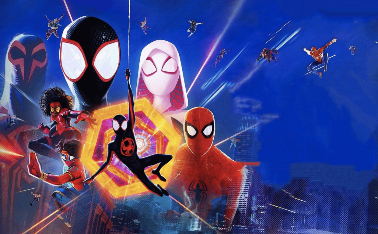
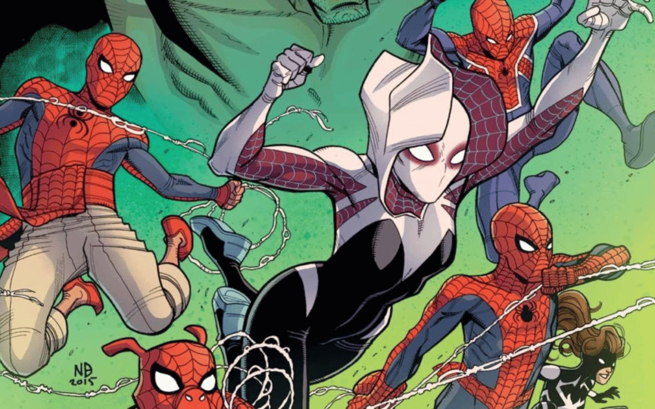
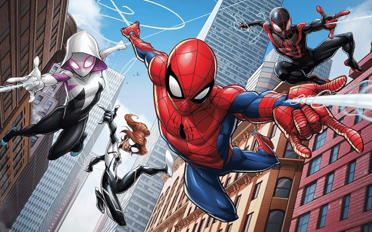
A unique facet of Into the Spider-Verse’s visual palette was developing distinct styles for the different multiverse characters. While the diverse Spider-heroes populate the same environment together, each has its own complementary aesthetic:
- Peter Parker hews closest to classic Spidey comics with shading complexity and earthy textures befitting his veteran status. There is realism to his world-weariness, both physically and environmentally.
- Gwen Stacy’s style taps manga/anime influence with rose pinks and blue hues. Her look incorporates gradients, flowing hair, and abstract backgrounds using speed lines, conveying her modern outlook.
- Spider-Ham has an overtly cartoonish look with cabbage green hues, squiggly outlines, and invisible pupils in line with the funny animal presentation. The hyper-simple style suits his humor.
- Peni Parker directly channels Japanese comics via doe-eyed proportions, dramatic angles, and sparks/stars circling her mech actions. The look bridges her tech/fantasy dual existence.
- Spider-Man Noir’s black-and-white coal-inspired texture reinforces his shadowy grit. Dust/scratch layers and dramatic spot blacks echo noir cinema conventions.
Showing multiple art languages coexisting reinforces the core conceit of wildly divergent universes colliding elegantly into one story thanks to the universality of Spider essence binding it.
Heightened Reality Punctuated by Freeze Frames
In addition to adapting comic book illustration techniques, Spider-Verse’s cinematography also dynamically encapsulates trademarks of sequential storytelling. freeze frames, exaggerated depth of field, and pointed perspective angles immerse viewers actively into the panels.
Some ways shots transport us right onto the page are:
- Freeze frames accentuate critical moments allowing environments and characters alike to creatively break the fourth wall with awareness of viewer space.
- Dramatic lighting efficiently sets the mood, often silhouetting in the tradition of noir graphic novels. Chiaroscuro contrast helps images pop sequentially.
- Depth of field frequently generates page-layered layouts with sharp foregrounds against softer mid and backgrounds. Specific elements shine in turn.
- Dutch tilt angles offer askew emphasis similar to the exotic angles comics utilize to grab attention and set specific moments apart from dynamism outside reality.
A Stylistic Triumph – With Impact Still Unfolding
Thanks to this medley of visionary techniques, both aesthetic and technical, Spider-Man: Into the Spider-Verse didn’t just dazzle viewers but fundamentally redefined the possibilities of computer animation. It demonstrated how CGI can transcend mere realism toward celebrated stylization when guided by inventive artistic philosophies. Poignant production design fused with state-of-the-art animation technology spelled creative revelation.
As highlighted by its much-deserved Oscar win for Best Animated Feature, Spider-Verse essentially expanded the animation genre by proving the viability of radically unconventional aesthetics beyond shorthand curiosity. Its stylistic impact continues propagating through subsequent animated projects and creative fields far beyond Spider-branding.
By embracing imperfection and exaggeration simultaneously to bring sequential art to screen life, Spider-Verse crafted a uniquely welcoming world where suspension of disbelief becomes effortless. We yearn to linger within its living pages thanks to pioneering artists and engineers who ingeniously engineered controlled deconstruction of the fourth wall.
 FOR FANBOYS, BY FANBOYS
Have you checked out LRM Online’s official podcasts and videos on The Genreverse Podcast Network? Available on YouTube and all your favorite podcast apps, This multimedia empire includes The Daily CoG, Breaking Geek Radio: The Podcast, GeekScholars Movie News, Anime-Versal Review Podcast, and our Star Wars dedicated podcast The Cantina. Check it out by listening on all your favorite podcast apps, or watching on YouTube!
Subscribe on: Apple Podcasts | Spotify | SoundCloud | Stitcher | Google Play
FOR FANBOYS, BY FANBOYS
Have you checked out LRM Online’s official podcasts and videos on The Genreverse Podcast Network? Available on YouTube and all your favorite podcast apps, This multimedia empire includes The Daily CoG, Breaking Geek Radio: The Podcast, GeekScholars Movie News, Anime-Versal Review Podcast, and our Star Wars dedicated podcast The Cantina. Check it out by listening on all your favorite podcast apps, or watching on YouTube!
Subscribe on: Apple Podcasts | Spotify | SoundCloud | Stitcher | Google Play