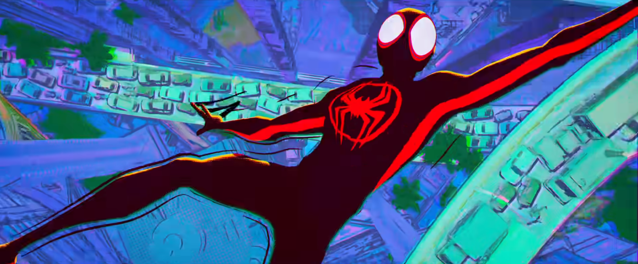
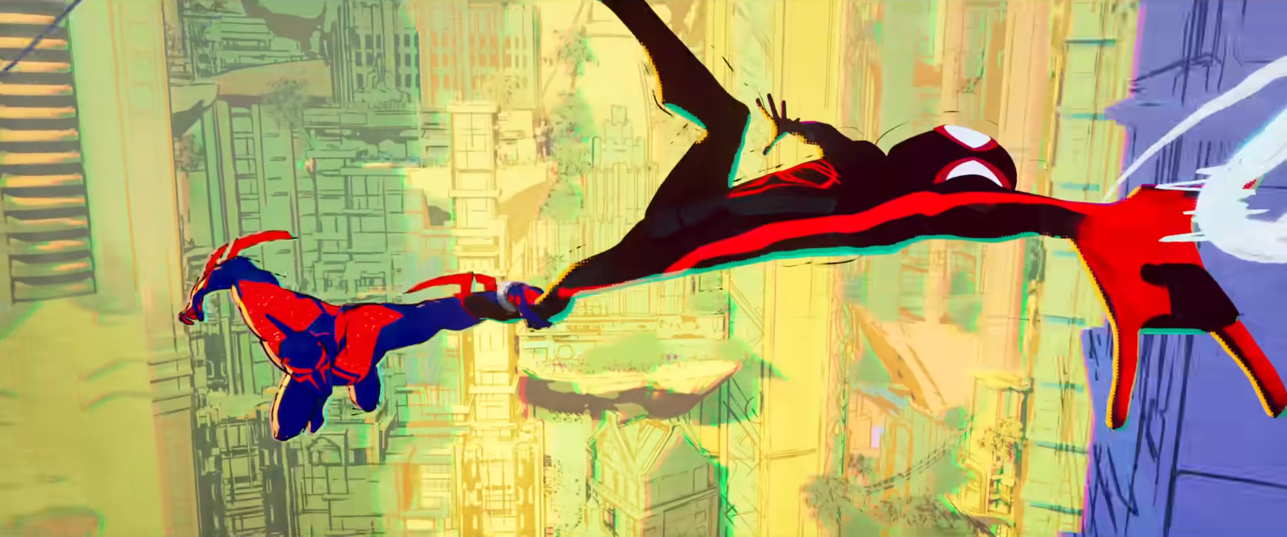
Who didn’t love Spider-Man: Into the Spider-Verse? Well, this guy sure did and it’s sequel, Spider-Man: Across the Spider-Verse (Part One) looks amazing! One of the first things I noticed when watching the trailer was the drastically different artwork in the scenes with Miguel O’Hara. It turns out that I wasn’t having a stroke and, according to writer Chris Mill, Across the Spider-Verse (Part One) will have different art in each universe! That’s both cool and a little scary.
The Exciting Stuff
Speaking with Collider Miller had this to say about Acorss the Spider-Verse’s art:
“It is, as Phil said, a very ambitious sequel, because we didn’t want to just sort of do the same thing again. And so the idea that we’d be going to different dimensions really opened up an opportunity artistically to have each world have its own art style, and to be able to push the folks at ImageWorks to develop a way to have each dimension feel like it was drawn by a different artist’s hand. Seeing the development of that stuff is breathtaking, and really, it’s the reason we keep doing it, because it’s so hard to get it right.”
As a person that reviews Anime every week, I am used to seeing drastically different art styles from project to project. I love it when western studios break free from the simplistic styles seen on shows like Ok K.O., The Loud House, or the repetitiveness of adult animation like The Great North and HouseBroken. Not that any of the shows are bad, just… boring looking. I am pleased to see that a studio, even one as awful as Sony, can see the benefits of expanding their art. Seeing a different style for each universe is very exciting. However, there is a danger.
ALSO SEE: Mister Fantastic In Multiverse Of Madness Rumor Roundup | Barside Buzz [Potential SPOILERS]
The Dangerous Stuff
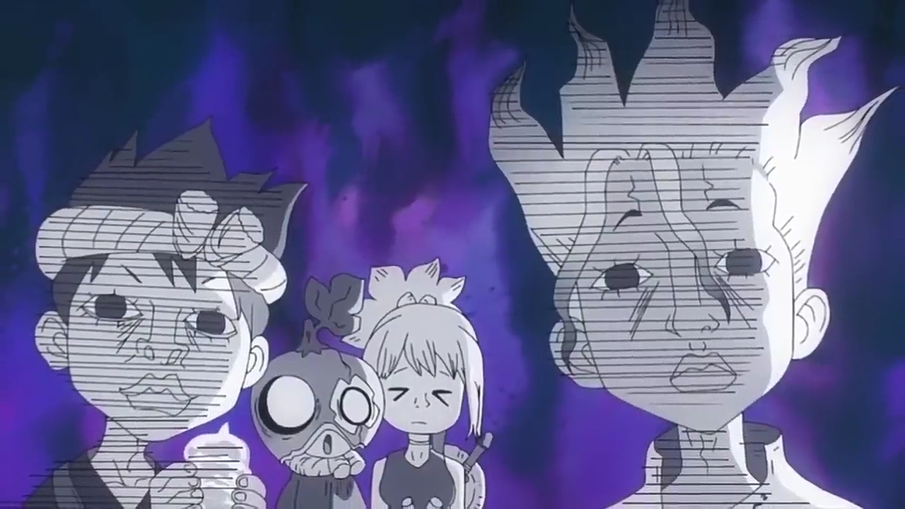
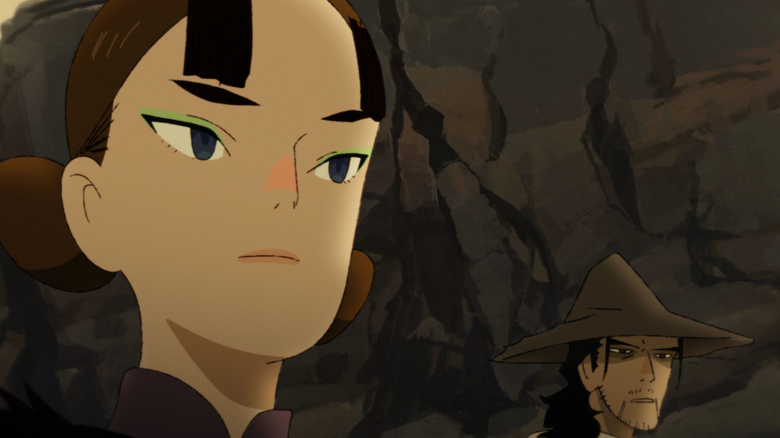
I mentioned how I love watching Anime and seeing different art styles. I love the ridiculous faces Boichi created for scenes in Dr. STONE where the characters are in shock or disgusted. Also, the highly stylized visuals for Words Bubble Up Like Soda Pop were easy to settle into. Alas, every now and then, a style just fails to be anything except a distraction. The Akakiri episode of Star Wars Visions had a style (see below) that just rubbed me the wrong way. I actually don’t know anyone, personally, that liked it. Then there are things like Aeon Flux from the west that look like… Okay, I won’t be mean, but I didn’t like that either.
You can see how easy it can be to lose an audience in a visual medium. Changing art styles multiple times in one movie is daring, exciting, but also dangerous. Regardless, I am putting my faith in So… Chris Miller, Phil Lord, and the animation teams. Sony can get bent.
Are you excited to see the different Spider-Man: Across the Spider-Verse (Part One) art styles? Let us know in the comments below!
SOURCE: Collider
 FOR FANBOYS, BY FANBOYS
Have you checked out LRM Online’s official podcasts and videos on The Genreverse Podcast Network? Available on YouTube and all your favorite podcast apps, This multimedia empire includes The Daily CoG, Breaking Geek Radio: The Podcast, GeekScholars Movie News, Anime-Versal Review Podcast, and our Star Wars dedicated podcast The Cantina. Check it out by listening on all your favorite podcast apps, or watching on YouTube!
Subscribe on: Apple Podcasts | Spotify | SoundCloud | Stitcher | Google Play
FOR FANBOYS, BY FANBOYS
Have you checked out LRM Online’s official podcasts and videos on The Genreverse Podcast Network? Available on YouTube and all your favorite podcast apps, This multimedia empire includes The Daily CoG, Breaking Geek Radio: The Podcast, GeekScholars Movie News, Anime-Versal Review Podcast, and our Star Wars dedicated podcast The Cantina. Check it out by listening on all your favorite podcast apps, or watching on YouTube!
Subscribe on: Apple Podcasts | Spotify | SoundCloud | Stitcher | Google Play